Progress Portals gives builders 1 branded link where owners can follow a project: 360° walkthroughs, layered site maps, photo galleries and reports, organized by reporting period. Viewers need no app and no login. The product was built by a construction team for construction teams, and it needed a brand and a website that read the same way.
The mark is a P built from stepped bars, like a progress chart. It pairs with a lowercase Poppins wordmark, progress portals, and the mark works alone where space is tight. Logo exploration ran from February to April 2026.
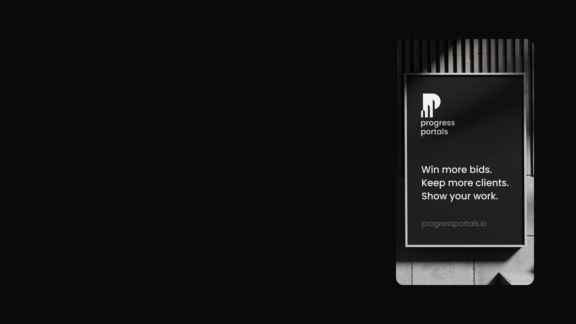
We then took the identity off the screen and onto the things a builder hands out: embroidered polos, mugs and posters. The posters make the product's case in plain lines, from "Your next project deserves a better view." to "Show your work."
The finished set also includes a logo animation, a visual identity film and a 3 m x 2.3 m trade show media wall.
The home page explains the product in the same 4 steps a builder follows: create a portal, add content, publish a period, share the link. It leads with the 2 flagship features, the 360° walkthrough engine and site maps with layers.
The site runs on the same design tokens as the Plus15 site: 11 greys, 1 Neon Hi-Vis accent, Poppins for reading and JetBrains Mono for labels. Pricing, about, privacy and accessibility each get their own page, and every page has a dark mode toggle.
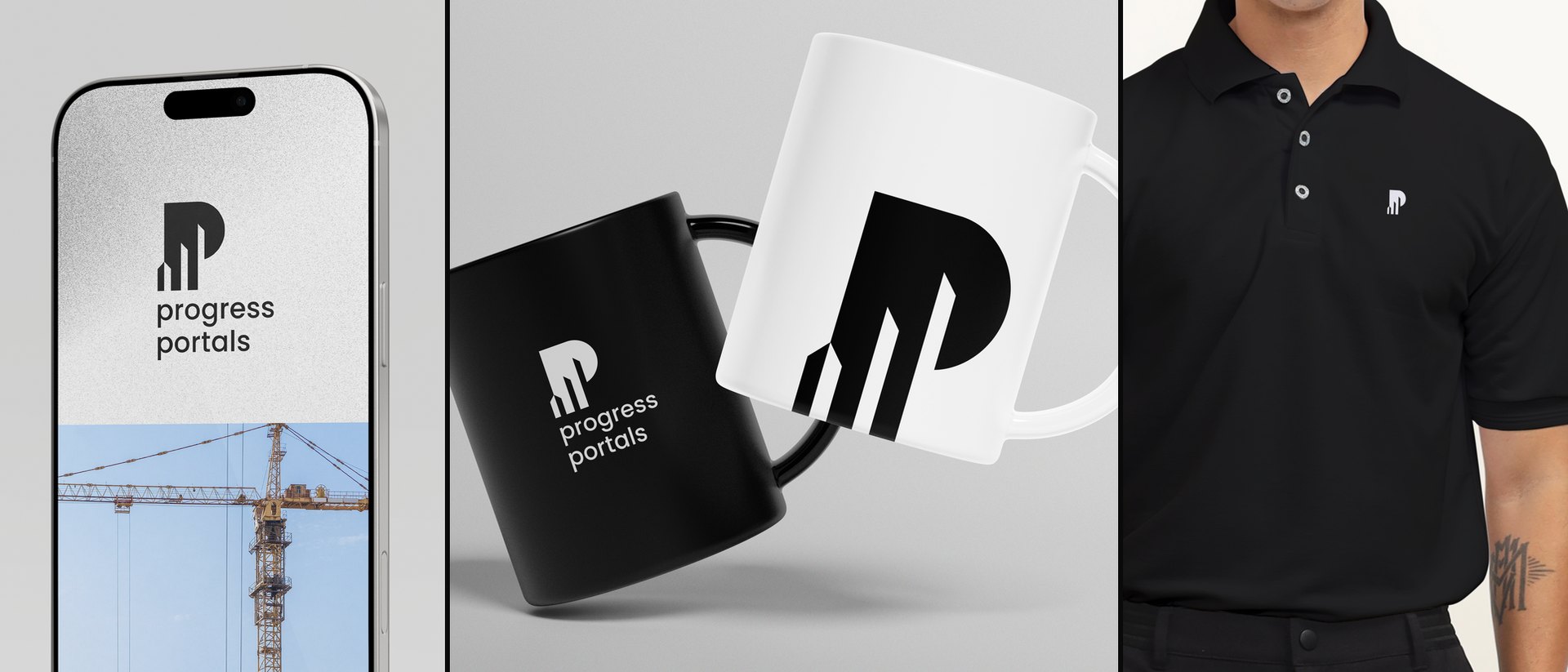
Brand applications · phone, mugs and embroidered polo
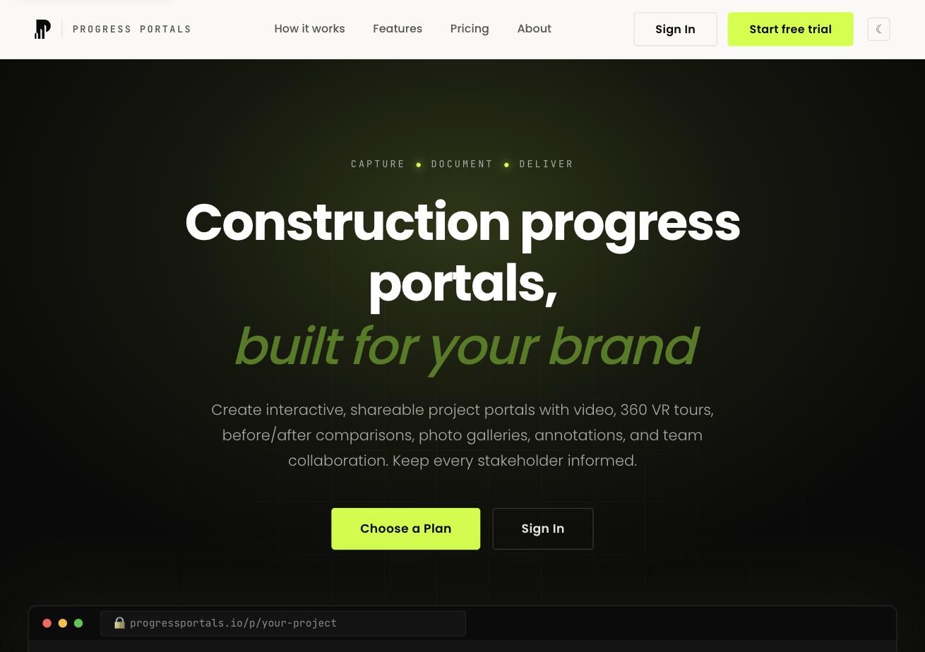
progressportals.io · home page
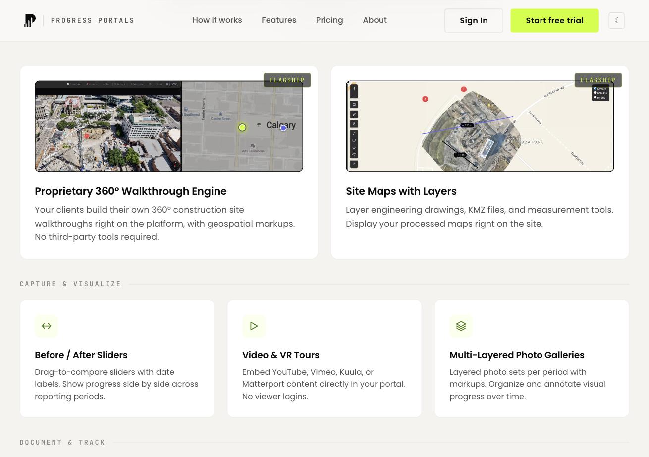
progressportals.io · capabilities