A buyer checks our website before they call, then meets the same name on a proposal, a slide deck and a hard hat decal. We needed 1 visual system that holds up in all of those places, not a logo and a colour.
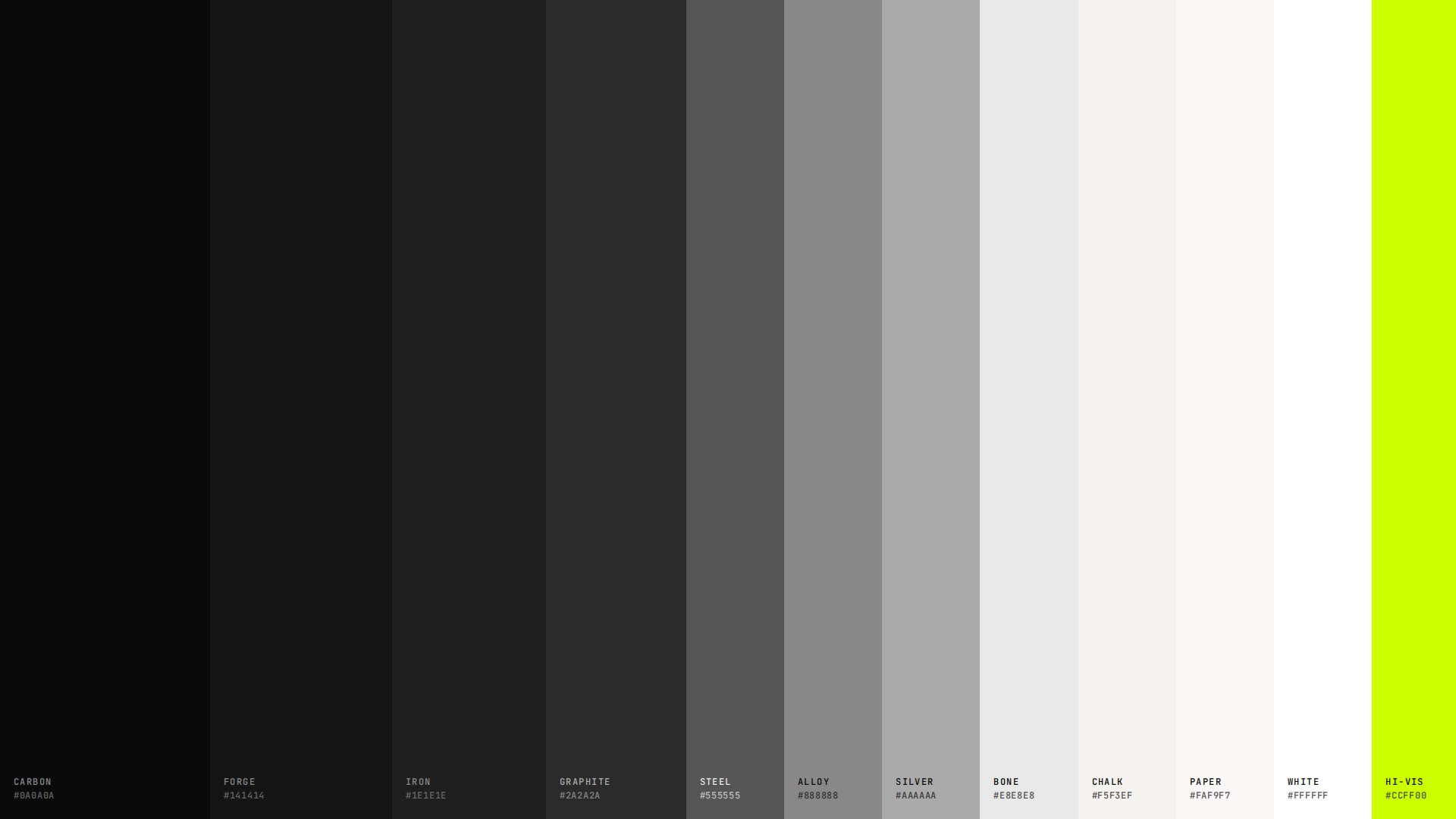
The palette is greyscale, and the photography carries the colour. The 11 tones run from Carbon #0A0A0A through Iron and Steel to Paper #FAF9F7. Dark sections step from Carbon to Forge, Iron and Graphite to build depth without drop shadows.
The single accent is Neon Hi-Vis, #CCFF00, taken from the safety gear our audience wears to work. It has 5 permitted uses, and each use has to answer 1 question: is this the most important thing on the screen right now?
Poppins carries headlines and body copy. JetBrains Mono is reserved for labels, data and captions, so a measurement never reads like a sentence. Orbitron is held for the PLUS15 wordmark and large stat numerals.
Everything is sized for the field: 48px minimum tap targets, a 56px menu button a gloved thumb can hit, and faint column lines behind the content so every page reads like a drawing set.
The web design system runs to 33 sections: foundations, logo rules, layout patterns, 14 components, motion, imagery, voice and a token export for developers. It went from v1.0 to v1.3 in April 2026.
A companion Brand Extensions guide carries the same system into proposals, tender documents, slide decks and trade show print. Its 12 sections add CMYK values, a Pantone 802 C spec so the accent survives print, type scales for Letter pages and 10 slide patterns for 16:9 decks.
The website is the working proof. It runs on these tokens, with the grid tightened to 5 gutterless columns and the grid lines drawn on every page.
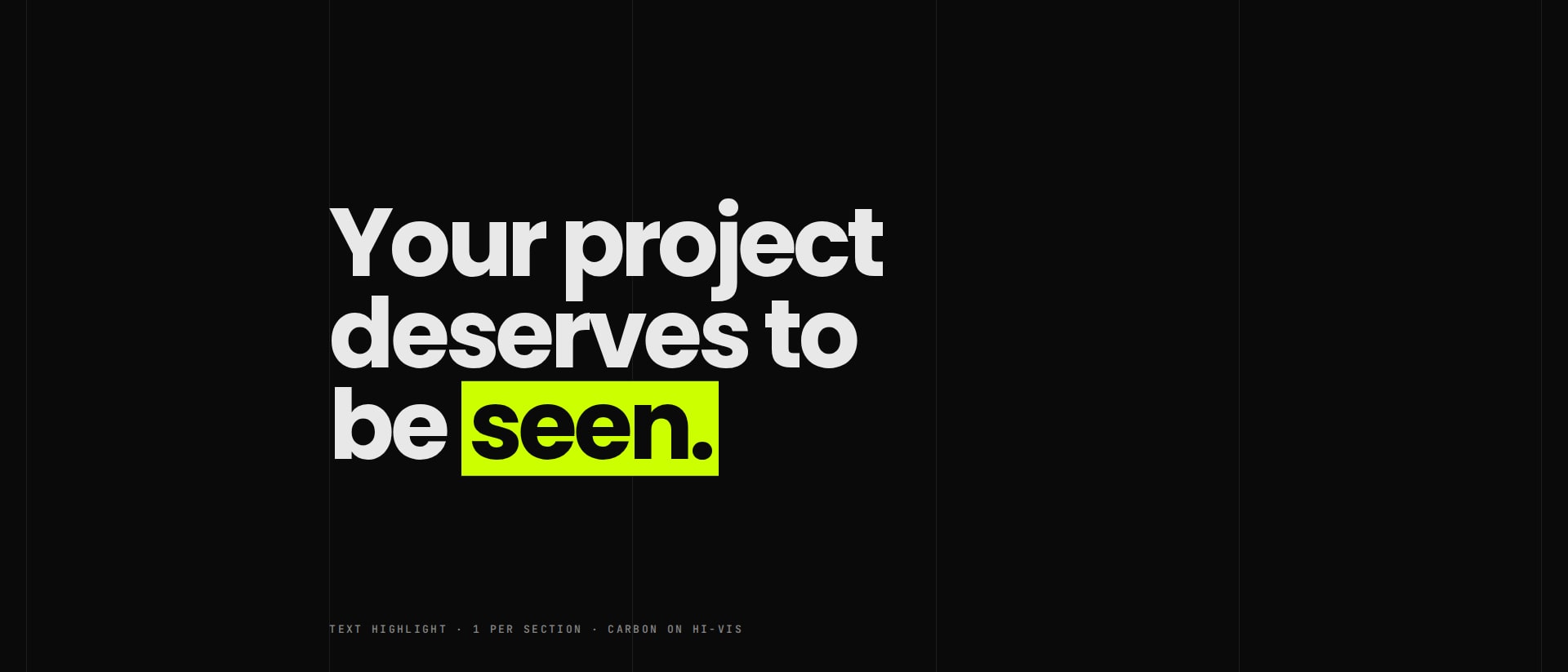
Neon Hi-Vis in use · the only accent on the page
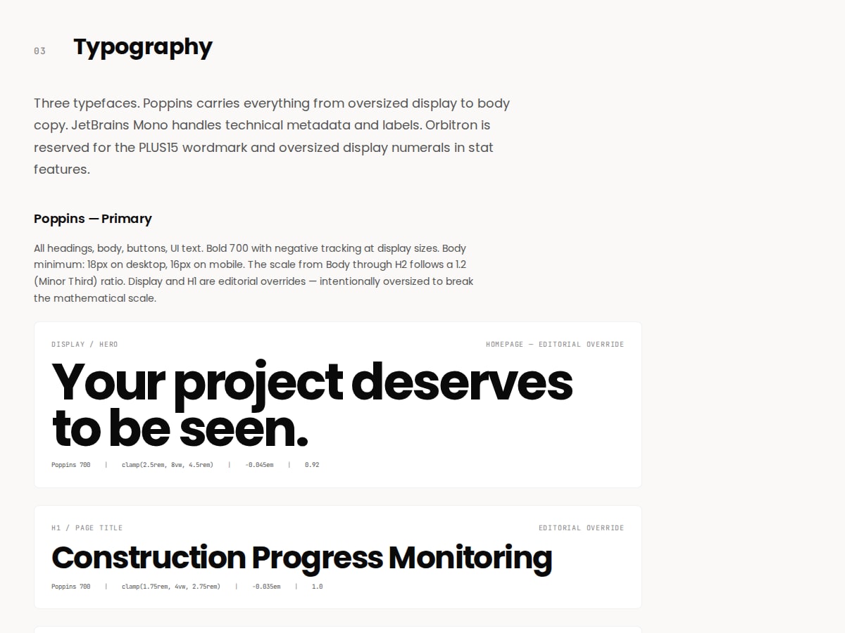
Design system v1.3 · typography
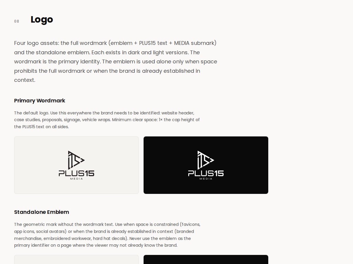
Design system v1.3 · logo rules